
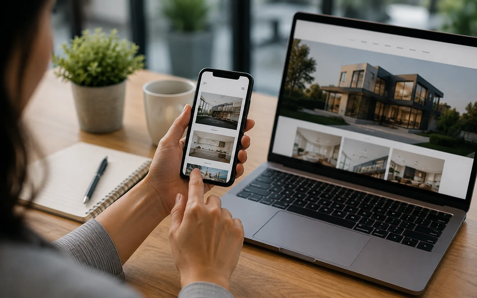
A mobile-friendly website is essential for businesses that want to reach customers online. Many people use smartphones to search for businesses, products, and services. Therefore, a website that works well on mobile devices can help visitors find information quickly and take action with confidence.
A website that is difficult to use on a phone can create frustration. Small text, slow pages, difficult menus, and buttons that are hard to tap can cause visitors to leave. Because of this, businesses should make mobile usability an important part of their website strategy.
What Is a Mobile-Friendly Website?
A mobile-friendly website adjusts its layout and content to different screen sizes. Whether someone visits from a smartphone, tablet, or desktop computer, the website should remain easy to use.
A good mobile experience should make it simple for visitors to:
- Read website content
- Navigate between pages
- View images and products
- Complete contact forms
- Find business information
- Contact the business quickly
Responsive design can help a website provide a consistent experience across different devices.
Why Is Mobile-Friendly Design Important?
People expect websites to load quickly and work smoothly on their phones. If a website takes too long to load or does not display correctly, visitors may leave before exploring the page.
A mobile-friendly design can make browsing more comfortable. In addition, it can help customers find important information without constantly zooming, scrolling, or searching for buttons.
For businesses, this can create a better first impression and make it easier for potential customers to contact them.
Improve the Customer Experience
A good website should make things easy for visitors. Clear menus, readable text, simple forms, and easy-to-find contact information can improve the overall experience.
For example, a customer searching for a local service on a smartphone should be able to quickly understand what the business offers. They should also be able to find the phone number, address, or enquiry form without difficulty.
As a result, a well-designed mobile experience can help visitors move from browsing to taking action.
Mobile-Friendly Websites Can Support SEO
Mobile usability can also support your wider SEO efforts. Search engines aim to provide useful results and good experiences for users.
Therefore, businesses should make sure their websites work properly across different devices. Fast loading pages, readable content, simple navigation, and a responsive layout can all contribute to a better website experience.
However, mobile design is only one part of SEO. Businesses should also pay attention to useful content, website structure, page speed, internal links, and other important SEO factors.
Website Speed Matters
A mobile visitor may be using a slower internet connection. Because of this, a website with large images or unnecessary features can take longer to load.
Businesses can improve website speed by:
- Compressing large images
- Removing unnecessary website elements
- Keeping pages simple
- Using reliable website hosting
- Checking website performance regularly
A faster website can make it easier for visitors to explore your pages without waiting.
Make Your Website Easy to Navigate
Mobile screens have less space than desktop screens. Therefore, website navigation should be simple and clear.
Use menus that are easy to open, buttons that are easy to tap, and headings that help visitors understand each section. Important information should not be hidden behind complicated navigation.
In addition, contact details and calls to action should be easy to find. This is especially important for businesses that depend on enquiries or phone calls.
Check Your Website on Different Devices
A website may look good on one phone but have problems on another device. For this reason, businesses should test their websites on different screen sizes.
Check whether:
- Text is easy to read
- Images display correctly
- Buttons are easy to tap
- Menus work properly
- Forms are simple to complete
- Pages load quickly
Regular testing can help identify small problems before they affect a large number of visitors.
Build a Stronger Online Presence
A mobile-friendly website can work alongside other digital activities to support your online presence. SEO, local SEO, social media marketing, and digital advertising can all bring visitors to your website.
However, getting visitors is only part of the process. Once they arrive, your website should give them a clear and useful experience.
Good UI/UX and branding can help businesses create a more consistent and professional website experience. You can explore 3MHQ’s UI/UX & Branding services if you are looking at ways to improve how visitors interact with your website.
Keep Improving Your Website
A website should not be treated as a one-time project. Customer expectations, devices, and online trends continue to change.
Therefore, businesses should review their website regularly. Check page speed, mobile layouts, content, navigation, and forms to make sure everything continues to work properly.
Small improvements can make a meaningful difference over time. For example, replacing a large image or simplifying a mobile menu may make a page much easier to use.
Conclusion
A mobile-friendly website can help businesses provide a better experience for customers and support long-term online visibility. Fast pages, simple navigation, readable content, and responsive layouts make it easier for visitors to find what they need.
Most importantly, businesses should focus on making their websites useful and easy to use on every device. With regular testing and improvements, a mobile-friendly website can become a valuable part of a successful online presence.
